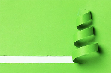
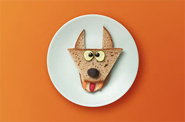
Writing to reach you
Hands up who’s heard of Albert Mehrabian? To be honest, neither had we until we started looking into various types of communication. His research into communication both verbal and ‘non-verbal’ has been much debated over the years. How companies communicate with new and existing customers is fundamental. But what about ‘non-verbal’ communication? If you are a regular reader of our blog articles, you’ll know that we talk a lot about brand and brand perception.
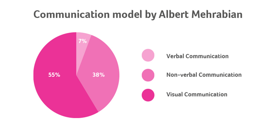
We have always championed the idea that creating the right brand and logo design for your industry is the often the difference between those businesses who are successful and those who are not. From key messages to colour psychology, there are many elements that work together to make a successful brand. You want your brand to create a positive emotional reaction on sight – in which case this is ‘non-verbal communication’. Building a brand and creating a logo means trying to convey the key messages, values and ethos of your brand in the simplest yet effective way. Not an easy task!
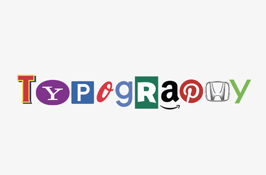
Where do we start? There’s a lot to consider in the design of a brand or logo. In addition to being affected by colour psychology, we’re also affected by font psychology. As with colour psychology, different fonts trigger different reactions. Therefore, using the right typography in a logo design enhances its visual appeal and will impact on customer perception towards your brand. Think about it – we’re surrounded by typography everywhere we go. From road signs to menus to signage and magazines. Consciously or subconsciously we are saturated with it on a day to day basis.
Each and every brand should have their core values and ethos at the centre of what they do. It’s the ‘why’ question that should always be answered before any creative can take place. ‘Why do we do what we do’. Once you’ve clarified this, you can then look at what typography options best reflect your business. Consider Walt Disney. Their font is instantly recognisable – and that was created in a time when there were far fewer font types available. But their font is key to their instant brand recognition and customer loyalty.
So why do certain fonts have more emotional appeal than others? As ever with creative it is all about the visual. Yes, your company name is important, but if the style of the name doesn’t reflect the type of company that you are or is bland, you’re unlikely to appeal to potential customers. The first touchpoint with customers is often your logo so it is vital it has instant impact.
"Good design, when done well, should be invisible.” Jared Spool.
By spending time ensuring you understand typography psychology, the personality that different styles convey, and how you can impact customer feelings could mean that you instantly have a competitive edge.
We have worked with many clients who require a logo designed from scratch and others that want to evolve their logo as it’s not having the right impact. Differentiation is key, but keep in mind your logo needs to be readable. Here’s some top tips to help you get started on selecting the right typography for your business.
Who are you?
Back to basics. Who are you and why do you do what you do? How do you want to be perceived? Knowing who you are and what image you want to portray should help you work out which fonts are appropriate for your business.
Who are you talking to?
Know your audience. A solid understanding of your existing and potential customers should ensure you will create the right impression. Take the time to do some market research or even a focus group from a sample size of your customers to discover their preferences in terms of shapes, styles, and colours. Appealing to them is far more likely to ensure success.
Creating a competitive edge
Know who your competitors are. To gain a competitive edge you need to differentiate yourself.
What do your competitors do that you like and dislike? What are their strengths? It’s not about ripping off ideas, it’s about using marketplace intelligence to work out how you can set yourself apart. Remember to look at other similar industries and the typography within their logo – it will help you work out what you like and may well spark some inspiration for you.
Longevity
Like much in life, things go in and out of fashion – typography included. Tempting as it is to go for a font that is new and different – consider if it will still look good in 5 years’ time. If the answer is no, step away from the font! Being an appealing font also means being a legible font. If customers can’t read it, they won’t know your name, which can be off-putting for them. Why would they buy from a business they don’t know the name of? Legibility ensures an element of trust and transparency.
How do I look?
Always, always, always check how your shortlist of fonts will look across a variety of media. It may look brilliant on screen but what about on your business cards, stationery, exhibition material and print advertising? It needs to create impact across all these channels. Any good design agency will show you a selection of fonts in a series of different scenarios to ensure it works within digital and print.
Typography psychology might be complicated, but your font shouldn’t be.
If you would like to chat about how we create a beautiful logo and brand for you, then get in touch.

Power of the spoken word
How to use word of mouth to grow your brand.
WOMM, (word of mouth marketing), it is all about influencing discussion about your brand and/or product.

Effective email marketing
Email marketing plays a integral role in your overall marketing strategy. This direct communication tool allows marketers to manage changing customer needs.
Graphic designer vs Canva
The explosion of Canva onto the design scene has led to a slew of people harnessing their inner creativity. Sometimes with not-so-great consequences.

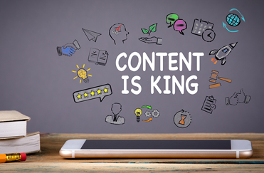
Content continues to be key
Content marketing is a key part of your marketing strategy. When you create and share content online it raises brand awareness of your company. Think of it as a virtual salesperson focussed on persuading a consumer to buy from you.

Video vs static
One of the earliest marketing lessons talks about market ‘saturation’. Usually, market saturation means success. But what about when it comes to digital advertising? In this case saturation has led to digital ads becoming ‘white noise’ or wallpaper to consumers.

Creating customer loyalty
Sound the klaxon! We’ve a new customer!! Everyone loves a new customer. It validates all your hard work when someone chooses your company. It’s a new opportunity to share content and reviews as well as cross selling other products.

Bringing your logo to life
Fun fact for you - history’s first recorded animator is Pygmalion of Greek and Roman mythology, a sculptor who created a figure of a woman so perfect that he fell in love with her and begged Venus to bring her to life. Every day is a school day!
Keep creativity in design
We like to think that everyone has an element of creativity but how it is executed is the challenge. Having a microwave doesn’t make you a chef.
Clients will often have great ideas that are a starting point for a campaign, but a designer’s job is to make that idea come...
Take out the bounce
Time is money so the saying goes. It’s an old phrase but it’s still relevant when we talk about an online presence.
Do you know how long do users stay on your website? Recent stats tell us it’s less than 15 seconds on average.

Less is more
We have long said content is king. That has not changed over the last few years; however, it gets harder to create content that engages with your target audience. Do you continue to churn out content or do you look at getting the most out of what you already have?
Feeling warm inside
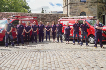
Edinburgh’s most trusted plumbing & heating engineers, Scott Findlay approached us earlier this year as they wanted to create a video to let customers know what to expect from their team.

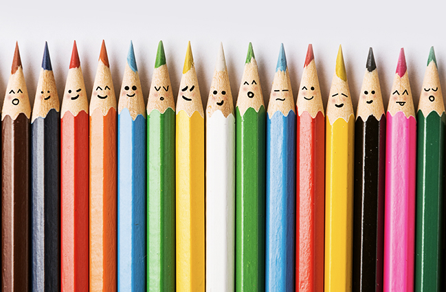
Customer psychology
“There is one more thing – it’s been emotional…” 10 points to those who can name the film that comes from?! *
It’s December folks which means there’s a deluge of Christmas advertising – which actually started right after Halloween.

Marketing in 2022
January. Already. Time seems to be flying in as quickly as marketing trends are evolving.
2020 and 2021 saw brands re-evaluate their activity, ensuring online activity became a priority in order to reach their customers...
Value of video marketing
It started with BetaMax and VHS. Remember them? Fancy machine with a black cassette that you carefully marked with a black marker to make sure no one recorded over your recording. And now we video on our phones and upload to websites. No video rental stores here.

Supplier collaboration
Collaboration - the action of working with someone to produce something.
Synonyms
cooperation • alliance • partnership • participation • combination • association • concert • teamwork • joint effort • working together

Collaboration - key to success
There’s new ‘c’ word this season… Collaboration. From fashion to medicine, customers are realising collaboration is the way forward.
Rather like the important ‘c’s’ when looking at diamonds, collaboration has it’s own ones. They are the basis for any good...
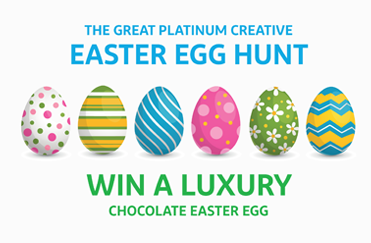
Easter Egg Hunt Competition
Winner of the Luxury Chocolate Easter Egg Announced. Thank you to everyone who entered our Easter Egg Hunt. For those of you that were struggling to find all 6, we can reveal that they were on the following pages...
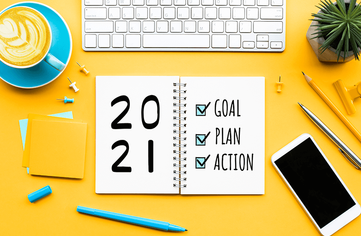
Key marketing trends in 2021
So we’ve said ‘so long, farewell, auf wiedersehen, goodbye’ to 2020 and we’re now staring down 2021. There has been a sea change in marketing activity, with businesses across the globe embracing digital like never before.

Re-ignite brand passion
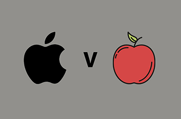
Brand love – is that really a thing? Think Coca-Cola vs Pepsi, Android vs Apple. There’s some hardcore loving from some of their customers. But those brands have spent a long time creating the fundamental requirements for a relationship – trust, loyalty and respect.
Designer versus DIY
“A logo? Why do I need to pay a designer to create a logo? It only takes 5 minutes. I can save money and do it myself”
Yikes! We’ve heard this a lot over the years. Just as well we’re not sensitive souls here at Platinum HQ...
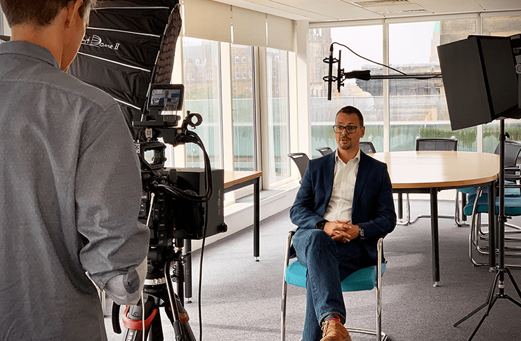
MBM Commercial video
The EIE (Engage, Invest, Exploit) virtual conference took place in October this year. As a key sponsor, MBM Commercial is there to help businesses grow. We worked with the team including Managing Partner Stuart Hendry to create a video, discussing the importance, now more than ever...

Return to sender
A 404?! It’s the page your server displays when it can’t find the URL requested by the user. It used to be the stuff of nightmares. We would throw our hand up in horror then re-direct people to the homepage. Surely that’s how we deal with it? Actually no. That’s the opposite of...

Checkpoint Charlie
Launching a website is always an exciting time. You’ve put in all the hard work – now you get to show it off to the world and start receiving visitors.
However, it can also be a stressful time. How do you know that you haven’t forgotten something important?
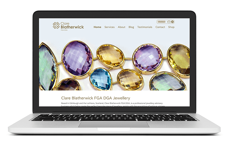
Clare Blatherwick
With over twenty years in the jewellery business, Clare Blatherwick is one of the most experienced jewellery professionals in Scotland. Before launching her business in 2017, Clare spent 10 years as Head of Jewellery in Scotland for Bonhams, one of the world’s largest auctioneers.
Video killed the radio star
Video production has often been perceived as an expensive marketing communication. However, video content can be created in your living room (and may well be until we get back into office life!). Think about YouTube and podcasting – these are easily created and uploaded.
Briefing for success
Every great project or campaign should start with a great design brief. But this is not always the case. Over the years, we’ve seen some brilliant briefs and some not-so-brilliant briefs. Every project aims for success and by putting the right brief and processes in place at the start, it should...

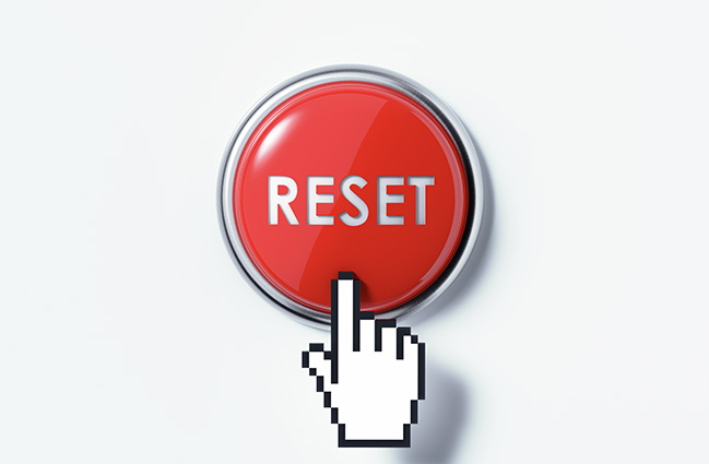
B2B – Back 2 Business?
B2B – Back 2 Business? But not as we know it. These last few months have taken their toll on industries across the globe. But many businesses have taken the opportunity to take a step back and review, reset and recharge their marketing activity.

Lets Get Fresh
A year is a long time in politics apparently. But it’s also a long time in terms of websites.
If your website is anything over one year old, then it definitely needs refreshed. If it’s over 2-3 years old, it may well need revamped entirely.
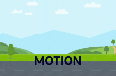
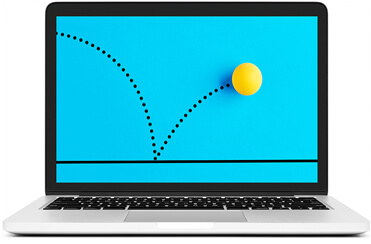
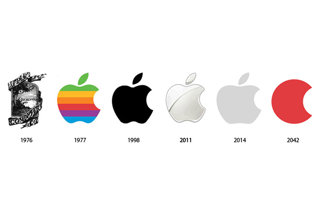
Keep on moving
Who remembers Google's logo before 2015? Really? Animation was starting to creep into marketing and in 2015 Google introduced its new animated logo marking the beginning of a shift change in online branding. Since then, there has been a steady increase in the use of animation.
Breathing life into old content
‘Old’. It’s not a particularly positive word. Old, irrelevant, out of date. We’re always looking for newer, better, faster. But what if we stop for a minute and consider ‘old’. When it comes to content, old isn’t always bad. It just needs repurposed and refreshed.

Coming of age
18! That means we’re grown-ups now right? We like to think of it more that we started out as a fledgling business and we have matured and evolved over the last 18 years. It’s been a great journey so far – in fact, we still have our first client that came on board 18 years ago.
Be a boy scout
Well this has been an interesting / challenging / what just happened (delete as appropriate!) few months…
But we are seeing a glimmer of light of what we think is the new normal.

The great content debate
Content is king we are always told. Luther Vandross would tell you there’s ‘Never too much’… although maybe he wasn’t actually talking about content.
Marketing in a crisis
Pandemic. Global crisis. Self-isolation. These are powerful words. We’re in unprecedented times. However, in these challenging times, we are seeing great human spirit and positivity. This is what we need to focus on. Helping each other until we get through this.
The Name of the Game
Don’t panic, we’re not channelling ABBA. Well, not today anyway.
We were recently approached by a new client, looking to change their company name. Ooh that’s a bit risky we hear you gasp. Well yes. And no.
For the love of colour
Blue. It features a lot in all walks of life – eyes, sky, sea, shoes, feelings to name a few. It’s uplifting in a calming way. Your choice of colour is connected to how that colour makes you feel and can impact many of your purchasing decisions, without you even really realising.
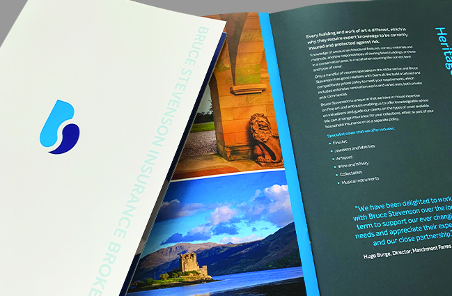
Bruce Stevenson Howden
Bruce Stevenson has been one of our longest standing clients and we have evolved the look and feel of the business over the last 8 years.
Having created and implemented a brand refresh in 2018, it was time to update the corporate brochure to reflect the...
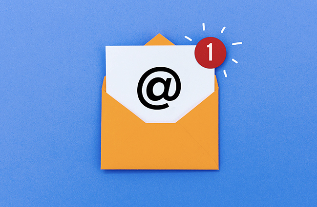
Emarketing isn't dead
You’ll know by now that Team PC love a stat – and the bigger the numbers the better. So here goes…
By 2023, there will be an estimated 4.3 billion global email users, according to Statista. That’s a lot of users. It won’t surprise you then, that with that...
Blue Monday
All we’re hearing today is about blue Monday and how it’s the most depressing day of the year. Pah!
Based on ‘cool blue’ being the pantone colour of the year we’ve decided to sack off the connotations of blue Monday being depressing. Here at Platinum HQ...
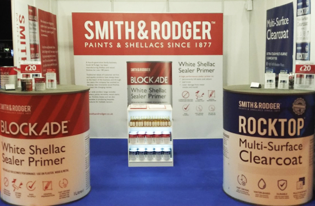
Smith & Rodger
We were approached by this family run paint and wood finishes company based in Glasgow. The business started out 1877 as a producer of the highest quality of wood finishes. It has since evolved and is also now a commercial paint supplier.
Print isn’t an eco-enemy!
As we head towards 2020, we look to continually evolve the business and embrace best practice. As such we have been looking at our approach to sustainability and our recommendations to clients on ‘environmentally friendly’ projects. Some of our clients have...
DIY SOS for SEO!
We’ve talked about the value of investing in a slick, user friendly website. But looks aren’t everything. Scratch the surface and you may find that underneath, your site isn’t as good as it looks. What you wanted to create was a site that engaged visitors but how do they find you in the first place?

2020 Design predictions
Ooh we love typography! It lifts a brand and gives it a simple but modern look and feel. Using a simple typography in design then lends itself to being decorated with a host of creative elements. Known as artistic typography, this trend is expected to flourish in 2020.

A missed opportunity?
Have pen, will travel. Think about it, how many times have you been given a pen by a supplier or client? Or how many times have you inadvertently picked up a pen and popped it in your pocket after using it? Not in a kleptomaniac sort of a way – but more as it’s an automatic reaction.
Knowledge is of no value
“Knowledge is of no value unless you put it into practice”
Anton Chekhov must have known a thing or two about knowledge graph panels. Or maybe the 19th century was a bit early…
We find that many of our clients aren’t...
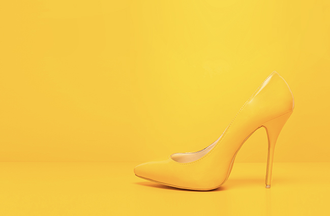
If the shoe fits....
You may remember our recent article ‘To print or not to print?’ if you’ve not read it yet, here’s a shameless plug to it. We thought we would follow up to it to discuss if direct marketing in a B2B environment is still relevant.
Hungry like the wolf
Not Duran Duran. But content, a necessary but difficult part of website creation and management. Your website needs it, but how do you get it, who writes it, and how much do you really need?

Passionate about Print
You may have noticed in our last insights article that we shared our love of print. We’ve spent years understanding the process of print and learning more about finishes and stocks. But, for the uninitiated, it can be daunting to try and work out what print will work best for your project.

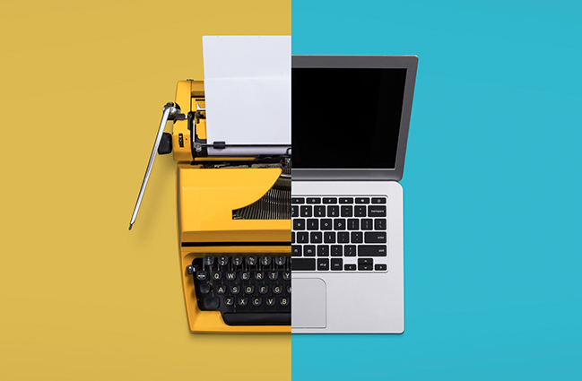
To Print or not to Print?
You’d be forgiven for thinking that print is a dying industry.
We can all hark back to the days when direct mail became the scourge of marketing. Customers were overwhelmed by the amount of ‘junk mail’ they received through their letterboxes or in...

E-marketing - getting it right
It’s been over 40 years since the first email was sent. No one could have predicted the effect this would have on the way we work. Email marketing exploded in the mid-nineties and it remains one of the most effective ways to engage with, and generate revenue from your customers...

Eggs in one Basket
Easter egg hunts are always fun. Being on the hunt for, or managing, several agencies to work together is definitely not fun.
The advent of digital saw many clients start to work with separate creative, design, advertising, marketing and digital agencies. There has been much...

Your quietest employee
The explosion of websites in the mid-noughties was unlike any other marketing initiative we had seen. At the end of 2018 there were a reported 1.8 billion websites in the world. Of these, less than 200million are active.
Platinum loves…
Here at Platinum HQ there’s a lot of things we love. Cake, a cold beer on a sunny day, more cake.
But we’ve always also been firm believers in loving what we do. For over 16 years we’ve spent time crafting great design and it’s been fantastic.

Half baked? No thanks!
A rather famous brand campaign once said ‘Good things come to those who wait’. But as a generation of time-poor individuals wanting the best results in the shortest time possible, patience isn’t really top of our agenda. It’s a bit like baking a cake for half the required time and expecting...
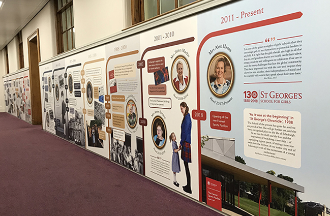
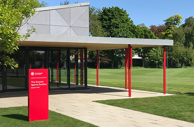
St George's School
A lot has happened over the last 130 years – not least the creation and evolution of St. Georges School in Edinburgh. From their humble beginnings in Melville Street with only 50 pupils to the present site at Murrayfield with both domestic and international students, the school has...
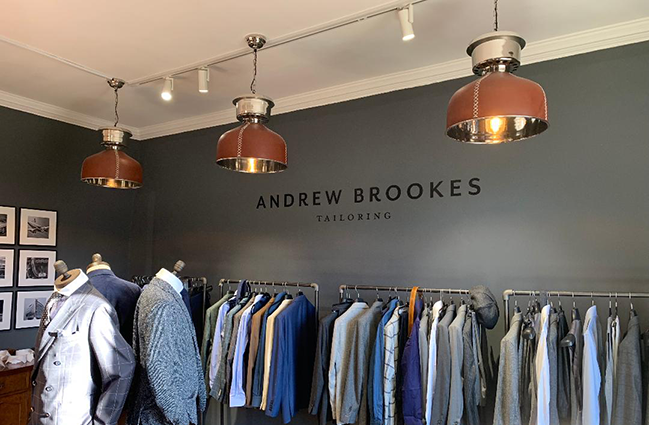
Andrew Brookes Tailoring
Suits you! We were approached earlier in the year to ask if we would work with Andrew Brookes Tailoring to help raise the profile of the brand in Edinburgh and throughout Scotland. We were lucky enough that they’d seen our work and really liked it.
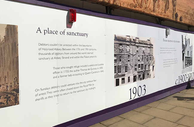
The Palace of Holyrood House
By Royal appointment (sort of!) The Royal Collection Trust (RCT) planned to refurbish and restore various buildings within the grounds of the Palace of Holyrood House. They needed to ensure there would be minimum disruption and inconvenience to the general public and the Royal Family...
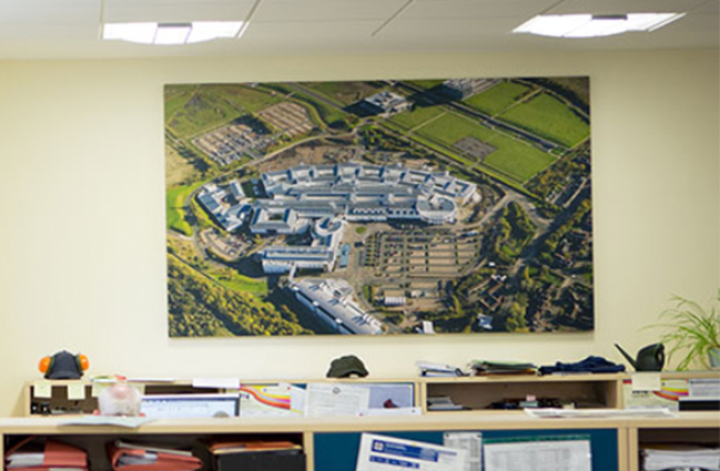
A different perspective
We were approached by The University of Edinburgh to design and produce a series of wall graphics to display within the newly refurbished Estates & Buildings department and the end results were very impressive.
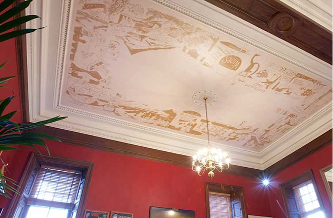
We're going up in the world
Up to the ceiling that is. We were commissioned to help restore the lovely illustrations that surround the ceiling within the Scotch Malt Whisky Society (Vaults, Edinburgh). Unfortunately the beautiful illustrations that had been created by Bob Dewar...
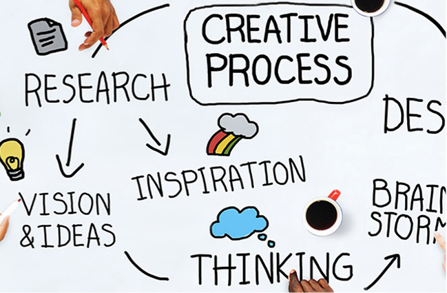
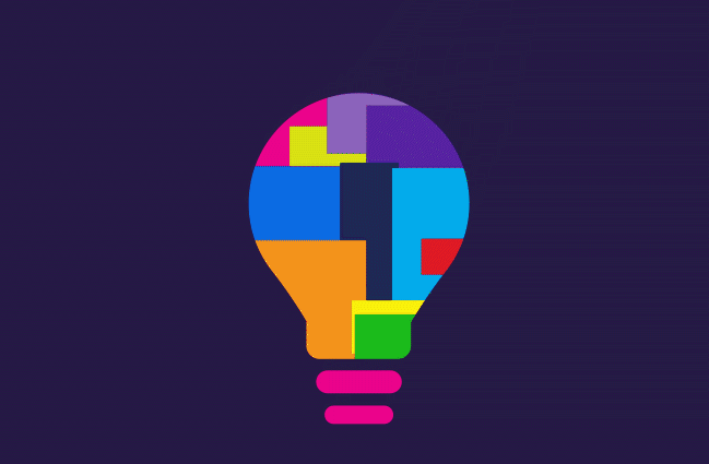
The Value of Design Thinking
Design isn’t just about your logo or how you decorate your office, it’s a way of thinking and allowing your business to thrive, creating new products and developing relationships with new customers.
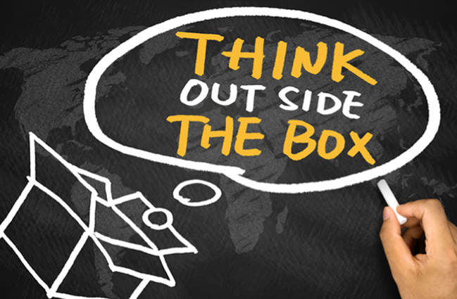
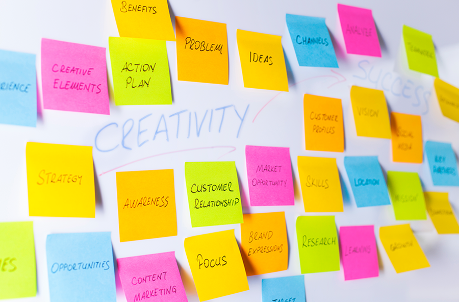
Creativity for Success:
Too many of us follow the crowd. We stick to the rules. We conform.
Yet, we know that creativity makes the difference between a mediocre business and a great one. The difference between success and failure.